My Role:
UX/UI Designer
Tools:
Miro, Whimsical, Figma, GDrive, Zoom, StoryboardThat
Prototype:
Presentation:
Collaborators:
Randy Hembrador, Ayaan Gill
The Problem
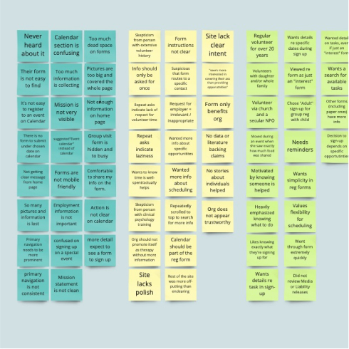
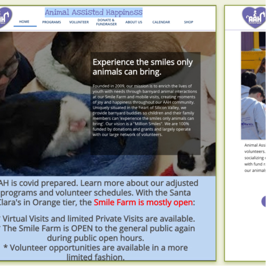
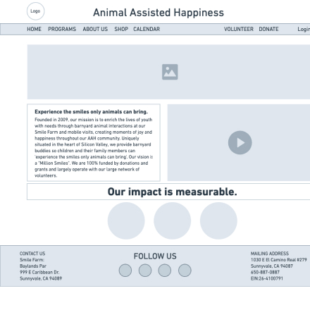
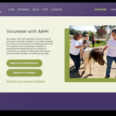
Confusing and inconsistent navigation in the Animal Assisted Happiness (AAH) website make it extremely difficult for volunteers and visitors to register for events resulting in significant reduction in engagement and event attendance.
Hypothesis
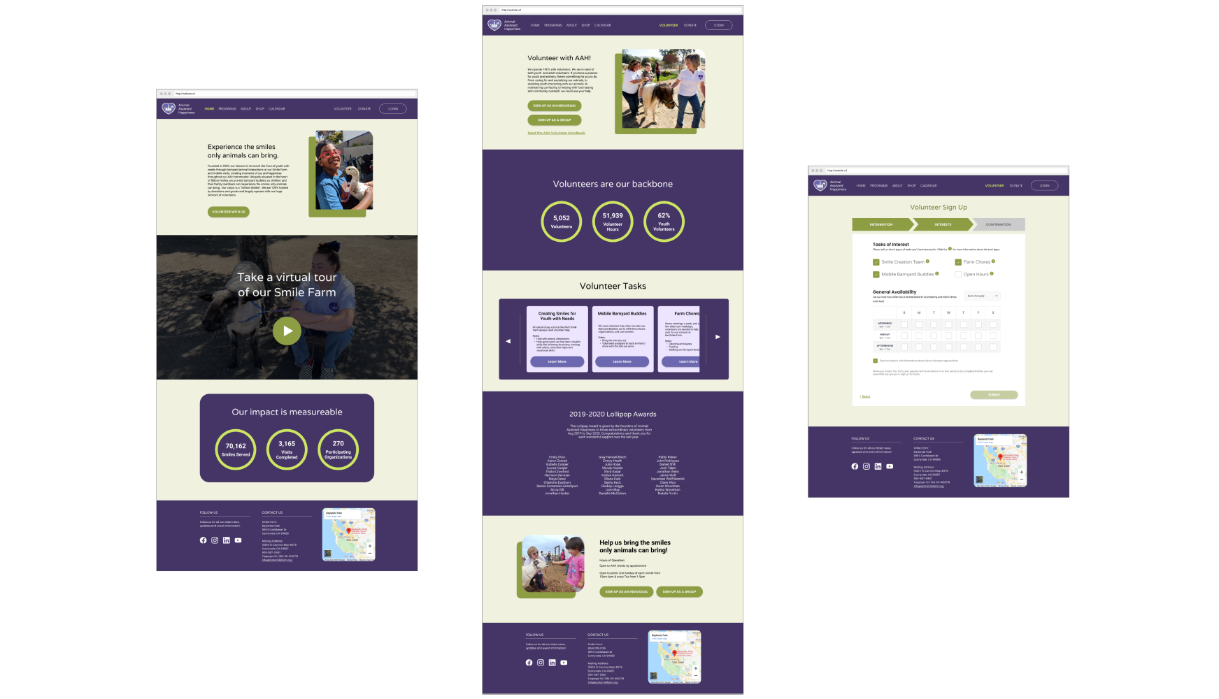
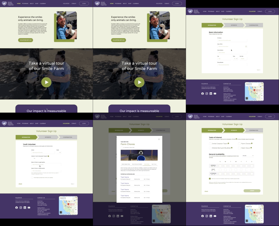
We believe that AAH doesn’t attract enough volunteers due to complex and not so user friendly registration forms and flow in current website design.
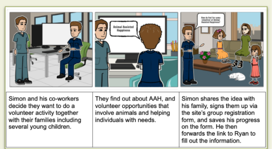
User Persona - Meet Simon
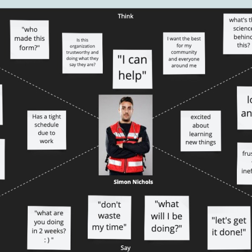
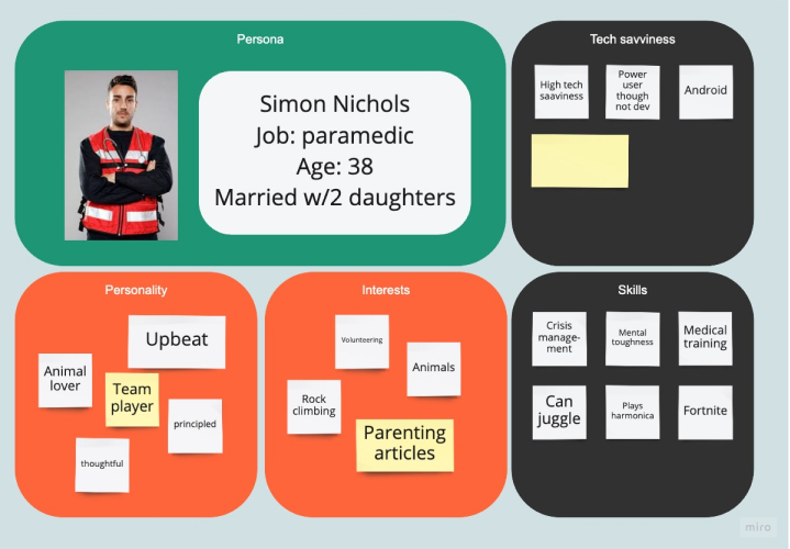
Simon, a hard working paramedic, likes to volunteer regularly and usually prefers group volunteer opportunities. He is very much into animals and farm life. To relieve his work stress, he often spends time with animals in farms and regain mental freshness.
Simon usually relies on technology for finding and signing up for volunteering opportunities. However, he is not very patient when it comes to technology and gets frustrated easily if he can not find or easily fill out registration forms. He really would enjoy a user friendly website where he can quickly access registration forms for faster checkout.
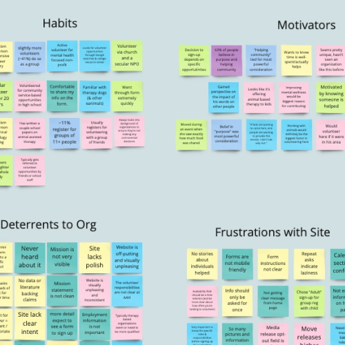
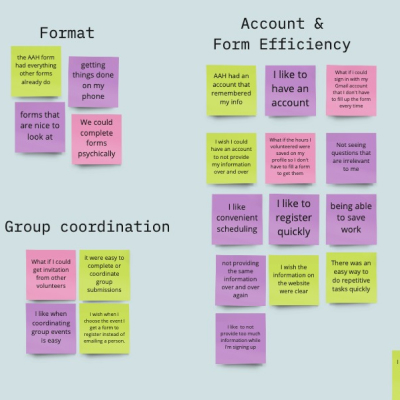
Interviews and User Survey
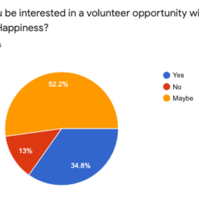
- 52% would be interested in volunteering at AAH
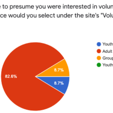
- 83% would be interested in adult volunteering?

